
By Cullen Bunn, Jorge Molina, Matteo Buffagni, Matt Milla
Blue is the new Gold. X-Men: Blue and X-Men: Gold, that is. Gold #1 was a big let down for a lot of readers, so there was a lot of hesitation on Wednesday as fan boys/girls picked up their copy of Blue #1. Thankfully, Blue turned out to be excellent. This first issue re-introduces us to the classic original five X-Men as they take care of a quick mission and head back home.
The writing is a lot of fun in this issue and feels very fresh. Bunn gives Jean, Scott, Beast, Iceman, and Angel lots of cute banter to throw back and forth as they deal with the problem at hand. However, he didn’t give Jean, their new leader, much to do and Scott seemed to be stepping on her toes a bit. Considering this young Cyclops doesn’t not want to turn into the Scott Summers of this world, he seems to be doing very little to prevent that. There is too much of the original Scott in him, but we will see what happens in the next few issues. With an appearance from a classic villain or two the reader will feel like this issue is a fresh start at the beginning for the original team, but also realize that things won’t play out the same this time. Of course, there is a twist and a back-up story, but they won’t be spoiled here. The twist is good, but not all that original. The back-up story is really good…you will definitely want to know more!
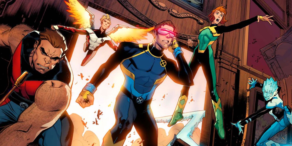
Overall, the artwork is really on-point, as it should be for a main X-Men title. It is great seeing the classic team being drawn young-looking and not as over-sexualized twenty somethings. In fact, Molina really captures the time displaced team’s youthfulness and frenetic energy so well he may be the driving factor behind the success of this title. It’s a fun, fresh, approachable look that should make them lovable again, to their public and comic fans alike. Everyone’s costume looks great and successfully combines elements of their some of their past classic uniforms. One small issue with the artwork is the profile shots of Jean. She is drawn with a very pointy nose and doesn’t complement her at all. It looks a little off and doesn’t match the quality of the rest of the art. However, Molina a did do a wonderful job on character expressions. There’s a great looking panel where Scott and Hank are yelling at each other. Explosions and bursting through surfaces are nicely drawn with lots of bits and pieces flying around. The panel layouts and scene progression are very cinematic and the artwork looks like they are taken from cells of a really good animated movie. The colors and inks are also on-point as Milla gives us nice vibrant colors in the uniforms that makes the team stand out against everything else. This is what an X-title should look like.
Don’t let X-Men: Gold prevent you from picking up X-Men: Blue. Everything that is wrong with last week’s title is done right in this book. As promised, we are back to basics in look, style, and story; it’s a breath of fresh air that will restore faith in the X-Men for a lot of readers. If the X-Men are going to return to greatness, then this title is where it will happen.


comments (0)
You must be logged in to post a comment.