
Hello, and welcome to Cover Story: digging as little into comic books as we can. Earlier this week Marvel’s latest mega-event comic Secret Wars encountered yet another delay, now pushing its conclusion back to January even though the relaunch it’s facilitating started in October. Even so, it was an interesting run and a nice occasion to revisit the original Secret Wars comic from 1984 and its sequel, Secret Wars II. The original Secret Wars was essentially (though not technically) the first event comic and still holds up today as a gloriously fun story of heroes thrown together to fight villains. There’s no deeper philosophy at play or grandiose controversy being evoked, just super-heroes and super-villains throwing down. The sequel comic is one of the most hilarious and terrible comic events ever, a delightfully out there ride through every bad idea applicable to the simplistic set up of the original. All this reminiscing and revisiting has also been a great occasion to reappraise the 3 generations of Secret Wars covers, a great treat given the level of prestige and talent afforded all three series. So, let’s dive into the shallow end and get the cover story on the top 15 Secret Wars covers.
15.
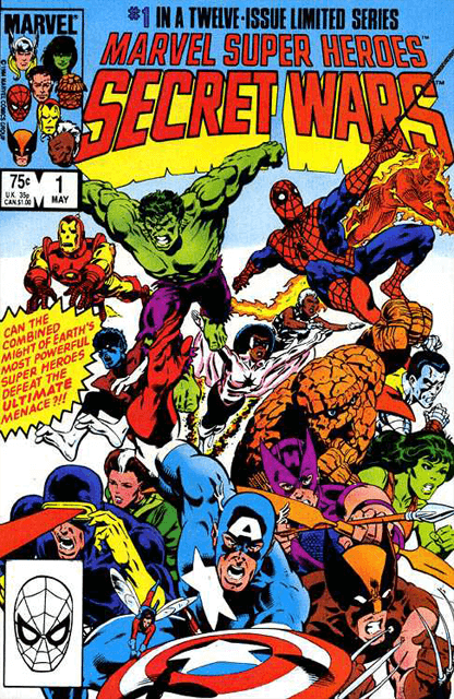
It might seem a little counter-intuitive to place the very first issue of Secret Wars at the end of the list, but that’s mainly because this is just a basic group shot. There’s no background and the characters are doing the fairly standard superhero act of “run at thing off camera.” Even so, this is one hell of a group shot. Mike Zeck did the cover art on the original Secret Wars and he was incredible at making the Marvel characters render as unique and definable beings no matter how cluttered the cover got. Christie Scheele has been credit with colors for the cover and it’s really her work that makes this cover work as well as it does because everyone looks perfectly blended. A big part of the strength is how the cover is parsed out, no one’s tones or color schemes overlap in any way, so there’s none of the awkward character bleeding that can end up ruining a group shot. At the same time the character lines and designs are all incredibly clean. There’s a dominant single color that isn’t obfuscated by needless pouches or pads or armor lines; it’s all clean, clear, and simple and is so much more striking as a result.

14.
From the earliest to the most recent Secret Wars, this cover comes to us courtesy of modern comic painter Alex Ross. Ross’ work is always top-notch, but it’s a special treat when he dips into the Fantastic Four well and this cover is a great example of that. Aside from just being an amazing rendering of the Thing and Galactus, the subject matter is one of the purest encapsulations of what Secret Wars is really about at its heart. It’s been said that Secret Wars is the comic book equivalent of a child throwing their bucket of action figures together at random and while I’ll come back to that phrase a lot in this list, it’s hard to think of a cover that better encapsulates it than this one. The Thing punching Galactus right in his big cosmic mug is such an amazingly insane and liberated look at these characters, it doesn’t make a bit of sense and really it doesn’t have to. I know there’s an explanation for this action within the comic itself, but really any context is only going to cheapen how incredibly metal this image is. It harkens back to the Contest of Champions where the Thing defended humanity in a cosmic boxing match only bigger and crazier.

13.
Fair warning: there’s going to be a shocking amount of Secret Wars II on this list. This opening cover is a little bizarre because it’s actually the work of 2 different artists; John Byrne, a legendary writer and artist, and Terry Austin, a solid artist in his own right. Just at first glance you can see a lot of Byrne’s influence on this cover, especially on characters like Wolverine, Captain America, and Colossus. Aside from just being a cover with text, an automatic positive, what I really love about this cover is the incredibly bizarre team of heroes assembled to face The Beyonder, a cosmic being whose power eclipses nearly any threat Earth has ever faced. The dude once trounced Galactus without breaking a sweat and the heroes assembled to face him are like Dazzler and the New Mutants. Knowing the insane, near self-parody, events of the series to come I have to wonder if that was intentional in some way. This was right around the time Marvel’s greatest superhero team, the West Coast Avengers, were hitting their stride, so it was a big time for C-listers suddenly getting the spotlight. I also assume the Los Angeles focus from that series is why this cover isn’t taking place in New York. Still, the shattered ground and eerie, elongated shadow are nice touches even if the folks at hand and eventual reveal are less than stellar.

12.
Back to Mike Zeck’s Secret Wars covers and this time it’s got a punny title and everything. Firstly, this cover is just wonderfully put together; a great use of the group shot dynamics Zeck and Scheele use for issue 1 only now used for a more ambitious reason than just “hey look at how many heroes are in our comic.” Additionally, the basic design of the central mystery hook is pretty great, especially given how much of a core Marvel mystery Dr. Doom’s face has always been. I especially like the way the Doom mask is facing back towards the reader and that weird yellow glow around Dr. Doom is a pretty imposing complement to his unfathomably cocky pose. What really sells this cover though, is the dumbfounded look of shock and surprise on everyone’s face. Given that the reveal is just “Dr. Doom is now handsome again” I really don’t think the dropped jaws were really warranted, especially folks like Thor and Captain America who look more shocked than they ever have in their whole career. Actually, I think the best shocked faces are probably Iron Man, who’s managed to make his armor develop a mouth hole simply so it can be left agape, and Spider-Man. With Spider-Man, you somehow know exactly the doofy face he’s making under the inky blackness of his costume, though I think a lot of that comes from his ridiculously ballooned up shoulders.

11.
Pictured here: Spider-Man and Wolverine fighting it out over who’s Marvel’s most merchandise-able character. Seriously, if there was ever any doubt or surprise that Secret Wars was developed specifically to help promote the Mattel toy line of the same name, this cover should pretty solidly confirm it. Actually, Mattel’s decision to court Marvel for its hero properties was brought about by rival toy company Kenner’s acquisition of the rights to produce DC figures and DC publishing the toy tie-in comics Super Powers by Jack Kirby, which essentially makes Secret Wars yet another integral element of the Marvel Universe and the structure of modern comics as a whole driven by Jack King Kirby’s contributions. As for this cover itself, it’s one of the best action covers to come out of any Secret Wars. What really sells it is the way everyone is moving; Spidey’s so full of boundless energy, diving off Colossus towards Wolverine as Cyclops, Nightcrawler, and Storm all fumble about with their powers. There’s a lot of diversity to the action at hand and it does a good job giving everyone a unique physicality to match their skill.

10.
This one’s a variant cover from the modern Secret Wars series, but it’s too excellent not to touch on. The credit for the cover goes to Tom Coker, but the initial idea was inspired by the very insane concept from Secret Wars that Molecule Man is a reality bomb and that by gathering up a bunch of Multiversal Molecule Men you could launch them at higher cosmic beings like a cruise missile. Given that Molecule Man has gone head-to-head with the likes of the Sentry and lived to brag about it, seeing a bajillion of him is a terrifying prospect especially with how incredibly angry they look. My favorite aspect of the cover may actually be that they went with the classical design for Molecule Man, with the crazy flipped out hair, zig-zag face, and shoulder pads so big they must exert their own gravity well. A nice additional touch is that if you look closely you can see the Molecule Mannado is set against a background of Kirby Dots.

9.
I love the visual design of this cover, but I love even more that it’s not necessarily metaphorical. Obviously, it represents the Beyonder closing his grip around the Earth while being opposed by its least impressive assemblage of heroes since the last Secret Wars II cover, but at the same time the Beyond could just be giant-sized and trying to grab the Earth like a balloon. Christie Scheele is still on color duty for Secret Wars II and she’s in great form as ever, especially in blending the deep violet of space with that kind of sickly yellow energy of the Beyonder; a pretty similar energy to Dr. Doom’s glowing aura from cover #12 actually. However, this cover is sporting Al Milgrom as the artist and while talented he’s no Mike Zeck as evidenced by some of the very stiff and unnatural poses of the heroes down bellow, especially Tigra. Speaking of Tigra, it’s still amazing to me that when throwing down with the looming cosmic menace of the Beyond the Avenger’s first call was to Tigra, Black Knight, Mocking Bird, and Daredevil. Incidentally for the curious, I have no idea who the schluby blue suited gentleman in the upper left hand corner is or why Marvel felt he was a thrilling enough character to get a spot on the “Beyond Conquers The World” cover of their major event comic.

8.
Now back to Mike Zeck and Christie Scheele being an awesome duo. This is easily Zeck’s most Kirby inspired work, with the very angular face on Dr. Doom feeling like a deliberate reference to Kirby’s bigger and blockier style of character design. Like the last cover from these two there’s a great blend of stripped down detail and focused emphasis on this cover, especially in the contrast between how detailed Dr. Doom is compared to the defeated hero’s behind him. His armor is full of lines and circuits and details while everyone else is boiled down to surface elements and singular colors; it’s a brilliant difference accentuated by the detail of lightning on Dr. Doom. At the same time, Scheele’s colors are the perfect match here, bathing the heroes in a that ominous red and magenta that only serves to emphasize the stark gray and green of Dr. Doom’s costume. I’d also point out this upper left hand corner features the faces of the heroes in the comic, which seems like a much better use of space than random men in blue suits.

7.
Oh my God that is fantastic. Seriously, there are other covers on this list I consider objectively better, but this is undeniably my favorite Secret Wars cover and possibly favorite cover in general as well. In case you’ve never encountered him before, this was Marvel’s big premiere design of the Beyonder, a doofy chucklehead with the curliest faux-afro imaginable all wrapped up in white parachute pants, hilarious boots, and the most amazing collar this side of disco Nightwing. This was the big, imposing, bad guy they were building the entire event around. He’s the crux of the comic and he looks perfectly ridiculous. It also doesn’t help that he’s doing the most ludicrously chipper walk Milgrom could draw, it’s like he’s trying to mimic that Leonard DiCaprio meme. He doesn’t look like some God-like being come to threaten the Earth in ways never before seen, he looks like a minimalist Disco Stu impersonator. The rest of the cover is also pretty amazingly constructed, like the list of characters allegedly in the comic who didn’t make the cut for the cover like the Living Tribunal and Mephisto. I assume those heavy hitters were cut to make way for those dynamite powerhouses of the superhero world Cloak and Dagger and the Power Pack.

6.
This is probably the most iconic cover to come out of all three of the Secret Wars as it marks the premiere of the incredibly popular black suit Spider-Man. The black Spider-Man suit itself has got to be one of the best costume redesigns ever achieved. It’s sleek, cool, and minimalistic with an interesting back-story that served to give it a unique identity and purpose without losing the immediate recognizable identity as Spider-Man. Additionally, this is a pretty great intro for the suit especially given that even back then Spider-Man was one of Marvel’s biggest sellers so giving him a fairly permanent visual redesign was a big deal. It’s actually a pretty clever visual metaphor, with all the plot related action and story content flying around in the background and Spidey’s new costume is just slapped front and center over all of it. Incidentally, the visual design of the background chaos is absolutely superb, another great example of the Zeck/Scheele group shot and how incredibly complementary these two creators are. Like cover #11 I especially like the way everyone is engaging in unique actions and powers like Mr. Fantastic stretching around, Hulk hurling a boulder, and Iron Man laser strafing the field.

5.
Another modern Secret Wars variant, this one by Yasmine Putri. Though this cover is more or less in line with Alex Ross’ vision for issue 2 (a large group shot of Dr. Doom’s Thor Corp,) I chose this one mainly for the presence of Jane Foster Thor so prominently on the cover. Of the many new heroes to emerge from Marvel’s push for diversity in the last couple years, Jane Foster Thor is easily the highlight; a tough as nails female hero that embodies the purest concepts of the Marvel Universe in a brilliant and modern way, so throwing her AND Frog Thor on the cover is a major win. At the same time I really like the lightning effects and color work on the individual hammers of this cover, the glow gives them a cooler and more powerful look that’s thoroughly evocative. I also note Thor Girl in the upper left corner of this cover, which might be the only time she and Jane Foster have ever shared a page together. Throw in Storm Thor and Valkyrie Thor and this is a veritable who’s who of awesome lady Thors. Also Thunderstrike managed to sneak in on the top right corner and the sooner we all remember there was a time Thor tooled around as a biker the better off we’ll all be.

4.
Unique among the Secret Wars covers this one is actually a combo effort by Mike Zeck and Terry Austin. Both men have a pretty similar style and one that fits well together. It’s a sort of workmanlike approach to characters that emphasizes crisp lines and clear forms and isn’t at all present here. Seriously, it’s amazing how much this cover is both playing against type for both men’s style and working so damn well despite that. The level of detail for Dr. Doom on this cover is insane, but it makes the image so much more memorable and impactful as a result. I especially like the way bits of metal and cloth are still falling off Dr. Doom’s shredded costume even now as he crouches defiant against his enemy. It’s also a pretty impressive feat of engineering that Dr. Doom’s energy gauntlets are still functional despite the insane amount of damage done to him here. The color work is also incredibly well done and the inking, by John Beatty, is very impressive. There’s a ton of lines and black on this page, but none of it looks cluttered or difficult to make out in an aesthetically unpleasing way, it’s an incredible balancing act.

3.
Another great cover from Alex Ross perfectly embodying the whole “smash your action figures together and see what happens” attitude of Secret Wars. Aside from featuring the biggest assemblage of heroes from across known space-time throwing down with giant, glowing, purple Dr. Doom what really sells this cover is how much it embraces these heroes as being from across the Marvel Multiverse. Some folks like Starlord and Captain Marvel are standard Marvel heroes, but there’s also Age of X Spider-Man, Dr. Spectrum of the Squadron Supreme, Juggernaut from Marvel Comics 2, the interdimensional X-Men supporting character and Weirdworld star Arkon, what looks like zombie Captain America, and even Lou Ferrigno Hulk. You can spot him in the bottom right hand corner right alongside the clutching hand of live action Japanese Spider-Man. I admit, I’m a sucker for action packed group shots like this, but having such an impressive medley of universes and heroes is a real treat. It’s most reminiscent of DC Comics’ Crisis On Infinite Earths, with Dr. Doom in place of the Anti-Monitor, a similarity I doubt was unintentional.

2.
This is another one of those covers that feels like a deliberate throwback to classic comics. In the mid-80s most comics had shifted away from the flashy, crazy covers that punctuated the Silver and Bronze Ages, though there were still a few notable exceptions, so it’s always nice when they deliberately affect that kind of verbosity and craziness. What I really love about this cover though, is that it wasn’t lying to us like a lot of Silver Age covers did. It promises the Hulk, buried under a Goddamn mountain, carrying the whole thing for his comrades and by God does it deliver. It’s actually pretty impressive that a cover as minimalist and simplistic as this can work as well and be as evocative as it is. Most of the page is just the craggy rock face of the mountain, with the Hulk and his fellow heroes lurking near the bottom of the page, but it really does stay with you. A big part of that is how well it fits into the Hulk’s mythos, he really does come off like the only Marvel hero who could do this, he’s the strongest there is after all.

1.
Just as it’s said Secret Wars is the comic equivalent of a child smashing action figures together, the Beyonder of Secret Wars II is undoubtedly that child, and nowhere does that come across more gloriously clear than this amazing Secret Wars II cover. Firstly, there’s the beautiful fact that despite his Godlike powers the Beyond still felt the need to stretch over those buildings to try to paw at the heroes angrily, presumably because he was giant-sized all along and was just using the buildings to hide behind. But actually, the idea that he would prefer the hands-on approach makes perfect sense for the Beyonder, he’s an impetus child who wants action, adventure, and for his toys to do as he says, so if he needs to physically reach down and smash Hulk into Colossus to get his kicks rather than just willing it, it’s at least in character. What I really love though, is how Hulk is a perfect rendering of what it might actually look like if a giant hand tried to grab someone: completely ridiculous. Speaking of Hulk, I do note that the assembled heroes are a bit more impressive now between him and Phoenix up near Beyonder’s cheek, but then again we are still relying on Warlock and Shadowcat, so things aren’t a total step-up. Also, Spider-Man is getting the least useful spider-sense tingles of his entire career.


comments (0)
You must be logged in to post a comment.